Scandicolour – (and color in general)
Color is making a comeback in a big way in 2019. The seemingly endless shades of gray have finally faded into itself, giving way to color. This is not just a throw pillow on a neutral couch either, the insertion of color ranges from brilliant bold swaths to complete color palettes.
A post shared by CaraGreen Sustainable Products (@caragreenproducts) on Jul 3, 2018 at 10:01am PDT
The first trend is bold color on an otherwise white or fairly neutral setup, with bold reds, yellows or whatever Pantone tells you as furniture pieces, artwork, casework or anywhere else you want to make a statement. (check out our latest post on Pinterest Design Trends, including the new trend on mustard yellow, pictured above)
A post shared by CaraGreen Sustainable Products (@caragreenproducts) on Jan 22, 2019 at 9:40am PST
Another colorful addition to 2019 is the Scandicolour palette, a somewhat feminine, suggestive pastel selection that comes from the European nations that we love to look to for inspiration. Scandicolour is poised to flourish in 2019, as the buzz heats up early in the year, and you should expect to see more social media and design attention given to the term and technique. The trend of color toward the “Scandi” palette has always been “watched” and followed, but it has been only recently that the term has become more widespread and is attached to an actual set of colors. With some muted colors, they have added grays, pinks, and greens to bring a softer, earthy tone with more color than typical Nordic or Scandi style.

Durat solid surface, known for being a colorful outlier, hosted a talk on The Impact of Color, and it included a panel of some of the top designers discussing their use of, or lack of use of, color. There was no arguing that the direction of design is a vibrant, colorful fingerprint of who you are and what you represent and demonstrating that through color.
The Memphis Movement
The Memphis Design Group was formed in the 80s and introduced designs styles that were meant to be antagonistic to other styles at the time. Using a lot of color (laminates) and chunky finishes (terrazzo), Memphis Design is making a comeback. As Mid Century Modern fades, Memphis is poised to pick up some of the design furor. Ironically formed in Italy, the Memphis Design group’s embrace was heavy on geometry shapes in unorthodox applications.
This movement is making a comeback in clothing, furniture, art installation, jewelry, and most definitely interior design!
Passamenterie


Design with all the trimmings. Ever wonder what trend that tasseled 80s jacket employed? That is passementerie and it is making a comeback. Look for tassels skirting the base of couches and chairs, and pillows with pom poms to toss you back into the 80s. Hey Mickey.
Biophilia
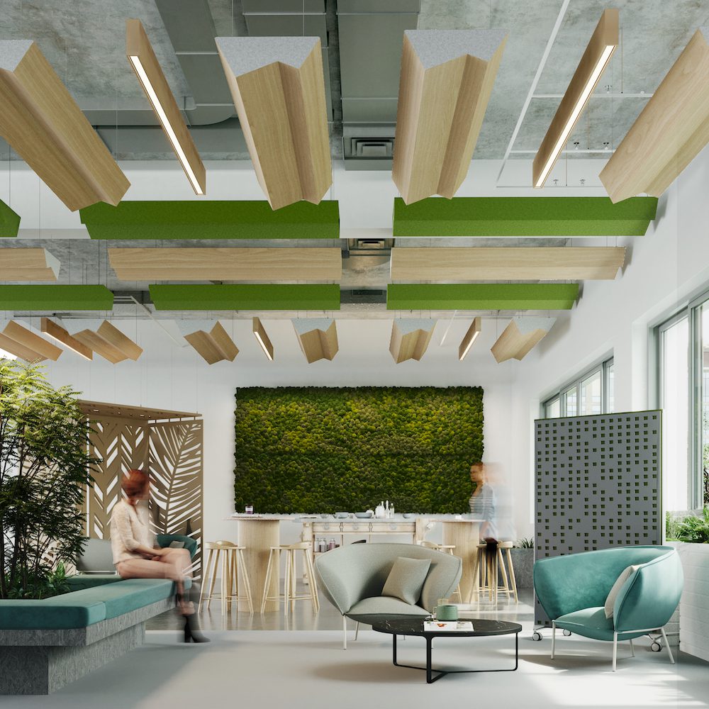
No this is not some sordid affliction, rather it is the LOVE of NATURE! And our desire to be affiliated with it. Biophilic design was the rage in 2018 and educational courses were cropping up everywhere to hear about it. Don’t expect that to slow down as we continue to bring nature into our spaces with daylighting, plants, wood grains, warm surfaces, and textures.

Out are the harsh cold surfaces, that make you want to take your Quinoa bowl (or cheeseburger) back to your desk, and in are warm to the touch organic surfaces that make you want to sit down and talk to Nosy Nina from Accounting. Herb gardens, walking paths, healthy foods, great air quality and community all have a place in biophilic design and will continue to trend up in 2019.
Hygge
The word with the most confusing pronunciation (Hoo-gah) actually represents a very welcome trend: coziness and comfort. While comfort can be embraced in many design facets, Hygge is focused on the close intimate comfort that is hot in Scandinavian design right now.
A post shared by Hygge Stay (@hyggestay) on Jan 3, 2019 at 5:00pm PST
More than a tiny home, Hygge is actually a Danish term that was coined to represent the warmth and snug environment that you want to enter when you come in from a cold and damp winter. This is not just a warm blanket, candles and a snuggie though, this is a mindset where you put kindness and well-being first.
Expect to see more and more Hygge in 2019, and expect to be corrected every time you say it wrong.
How do you see these trends manifesting? How are you using them in your designs? There seems to be some overlap in the trends and they are starting to informing each other. Many CaraGreen materials fit these aesthetics, order samples here!